Dolby Cinema Releases Their Exclusive Artwork for The Last Jedi
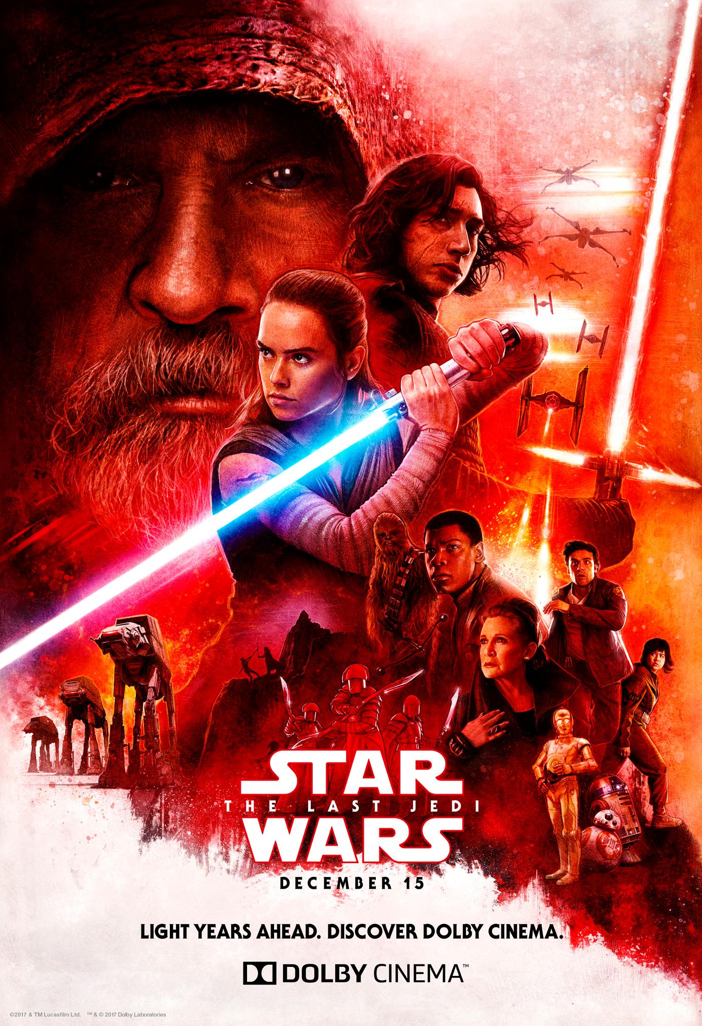
Dolby Cinema has revealed their exclusive artwork for The Last Jedi!
In a tweet posted moments ago Dolby revealed their art for the film, which is a very busy piece, and has strayed from the red on white contrast pattern that we’ve seen on most posters/promotional items and art work up until this point. Here is the tweet with the photo:
Check out our EXCLUSIVE artwork from @StarWars: The Last Jedi! In one month, see why Dolby Cinema is light years ahead – get tix: https://t.co/LhN9nrF20U pic.twitter.com/uRE9piqfP4
— Dolby Cinema (@DolbyCinema) November 15, 2017
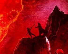
One item that really stands out to us are the silhouettes on the cliff. This appears to be Luke and Rey, with Luke knocking Rey down. Perhaps Luke is going to be putting Rey through a physical and tough brand of training atop the mountains of Ahch-To.
What do you think of Dolby’s art representation for The Last Jedi? I love the departure from the velvet cake red/white contrast, the blend adds a lot of personality to the piece, and although it has a lot of characters, doesn’t seem too busy, as well as being a welcomed departure from a photoshop composition.
The poster was illustrated by Paul Shipper:
I am very excited to be able to finally share this @StarWars #thelastjedi poster I illustrated for the films relea… https://t.co/iRyLoMfJGx pic.twitter.com/1a603ndNhs
— Paul Shipper Studio (@paulshipper) November 15, 2017
You can find me on Twitter @JohnnyHoey, let’s talk about this awesome artwork! What is Luke doing?
“For my ally is the Force, and a powerful ally it is.”
John Hoey is the Lead Editor and Senior Writer for Star Wars News Net and the host of The Resistance Broadcast podcast
"For my ally is the Force, and a powerful ally it is."

Bring down that saturation a bit https://uploads.disquscdn.com/images/e1d2c1db2c76ec95a2bd34cce953f7b47f55e997b6410ff516f5b0f01011d4a8.png
This actually looks MUCH better.
Now bring it UPPPPPP!!!
https://uploads.disquscdn.com/images/1abd734d0811bb6b6ffa1c25c9afa73ae7dfdfca5eb8ae38ab1cbad5fe889e66.jpg
Why couldn’t this be the official poster?
I mean it looks exactly like the theatrical one. Red all over the place. Characters places strategically in a descending order with Luke looming in the background.
It’s a nice one — the official posters are too symmetrical for my liking.
And too photo-shoppy.
Aleways appreciate your work SWNN, but please, please, PLEASE credit the artist in these kinds of articles! It’s Paul Shipper, and here’s his tweet debuting the poster 🙂
https://twitter.com/paulshipper/status/930849180410671104
Have anyone seen Snoke in any poster?
I cannot remember, I wonder why not.
I remember Hux, Phasma, in this one seem to be his wards…
If you see things as I do (someone who thinks way too much), Snoke is actually in the picture (and it’s not Luke).
Snoke is R2 CONFIRMED!!!
Spoilers
Ohhh right! Sorry!! Shhhhh
C3PO as golden fits better with his cloak, but they are characters/guys for as :))
You want him to be Leia, and our answer is NO 😀
Y’all know Luke is short for Lucifer, Prince of Darkness, right?
I hope you aren’t being serious. haha
Her saber goes from BLUE to PURPLE!
MACE WINDU CONFIRMED!
If I squint my eyes, I think I can make out a bantha or two.
Is it a Tatooine-ish binary sunset?
That’s what I was about to say.
This is my favourite of the posters so far.
I like this poster a lot more than the theatrical personally. It has better visual flow with the sabers drawing your eyes around the poster rather than the more centered theatrical poster. Also less white space which I prefer. They style reminds me more of struzen I guess than the actual poster which is cool, but less iconic IMO.
I like this poster. A bit more than the theatrical one, but I do very much enjoy it. And I like the use of dichotomy between red and white. That said, is it just me or does Luke look a lot like Santa Claus? I mean, for granted; the beard seems a lot longer, but really all I can say is that he looks like Saint Nick from Hell. 🙂
Oh wow. I didn’t even notice their silhouette on the mountain, that’s pretty cool!
It’s still pretty red and white. It looks much better though. I like that cliff scene. I don’t like the whole red and white color scheme it doesn’t feel Star Wars to me. Where’s the greens and blues.
people want different… they get it and then they say oh it’s not Star Wars
I don’t want different. I like classic looking posters
That’s where I got my tix. Double feature with TFA. Can’t wait.
FANTASTIC!
Everything is ‘illustrated’ today. Lementing the hand drawn poster art of old.
Hand drawn poster art are illustrations. Photoshopped clusterfucks are the new norm, like this Hobbit fiasco:
https://techandle.files.wordpress.com/2014/09/hobbit_the_battle_of_the_five_armies_ver3_xxlg.jpg
cheapest, fastest, ugliest
I don’t care for the montage-type movie posters. It’s an incredibly pervasive approach, but I much prefer simpler, more suggestive designs. I liked the TLJ teaser poster. I loved the TPM teaser. Even with the vintage Star Wars posters, I much preferred the advance and teaser posters than the cram-packed theatrical one-sheets.
Phantom menace teaser is stil my best
Exactly, it looks more photo thank drawn though.